- No products in the cart.

The Rise of ‘Scientific Aesthetics’ in 2026 with Modern Sleek Font
In the rapidly evolving landscape of health and wellness, a profound shift is occurring. As we approach 2026, the ‘lifestyle’ branding of previous years characterized by soft pastels and handwritten scripts is giving way to a new era: Scientific Minimalism. Today’s consumers are more informed and more skeptical than ever. They are no longer moved by vague promises of ‘wellness’; they demand clinical efficacy and ingredient transparency.
To communicate these values, supplement brands are turning to medical grade typography. The font on a vitamin bottle is no longer just a stylistic choice; it is a psychological signal of authority. Modern Sleek Font, with their clean lines and lack of ornamentation, are the primary tool for brands looking to establish immediate clinical trust.
Sans-serif fonts are historically associated with modernism, industrial precision, and institutional clarity. In a clinical context, they mimic the aesthetics of laboratory reports and pharmaceutical packaging. This lack of ‘fluff’ signals to the consumer that the brand prioritizes data over decoration.
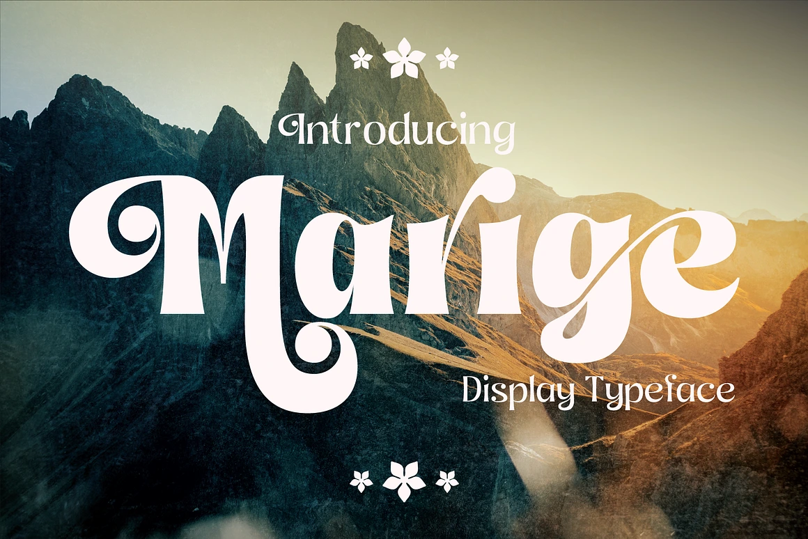
1. POPPIS – MODERN GEOMETRIC SANS SERIF WITH CYRILLIC

Poppis is a contemporary geometric sans-serif font that harmoniously blends technical precision with an artistic flair. Crafted for a striking visual identity, it exudes an exceptional visual appeal, making it ideal for branding, web design, and professional editorial endeavors.
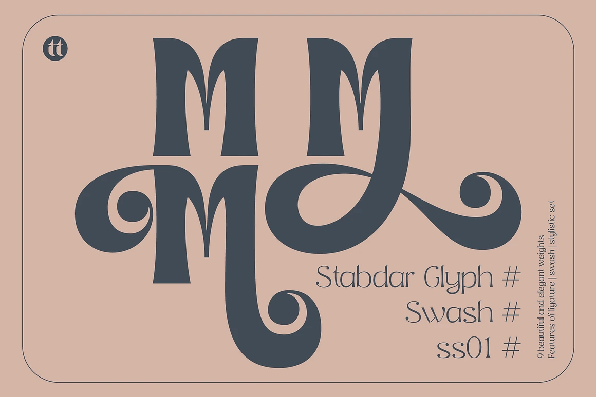
2. HONICK – CLEAN AND MODERN GEOMETRIC SANS

Honick is a clean and modern geometric sans serif font designed for designers, brands, and creatives who want to stand out with confident, contemporary typography. With 9 font weights from Thin to Black. Honík offers maximum versatility for any design project from minimalist logos to bold editorial headlines.
This font family includes 543 glyphs, 51 unique ligatures, and full multilingual support for 90+ languages. Every letter is carefully crafted with smooth geometric curves and subtle unique cuts, giving Honík a friendly yet professional personality.
Honick is a clean, modern geometric sans serif font designed for designers, brands, and creatives who want confident, contemporary typography. With 9 font weights from Thin to Black, Honick offers maximum versatility for any design project — from minimalist logos to bold editorial headlines.
3. GOOD ROME – THE FUTURE OF SANS SERIF

Good Rome – The Future of Sans Serif Design is a modern and sophisticated sans-serif typeface font that blends versatility with precision. Designed to harmonize futuristic aesthetics with timeless readability, it offers a sleek yet approachable look that adapts seamlessly to various design needs. Whether you’re crafting a bold brand identity, refining editorial layouts, or enhancing UI/UX experiences, Good Rome delivers clean, elegant typography that makes a lasting impression.
4. ARONSIKI – VERSATILE ELEGANCE FONT

Aronsiki Versatile Elegance Font for Global Design A modern sans-serif font family featuring 9 weight variants, from Thin to Black, offering complete flexibility for diverse design needs. With support for Latin, Cyrillic, and Greek scripts, it is perfectly suited for international projects.
FONT DESIGN CHARACTERISTICS
Geometric Sans-Serif: Aronsiki employs a geometric and clean sans-serif structure. Its letterforms are proportional and exude a modern aesthetic. Simplicity: Free from excessive decorative elements, the font delivers a minimalist yet professional impression. Design Consistency: Each character is crafted with harmonious balance, blending curved elements and straight lines seamlessly.
5. THANKS LAB – FUTURISTIC SOFT FONT

THANKS LAB is a premium futuristic soft font that combines sleek modern design with smooth, rounded edges for a bold yet approachable aesthetic. Perfect for branding, posters, headlines, UI/UX, and sci-fi-themed projects, this font is crafted to inspire creativity. With full support for Latin, Cyrillic, and Greek alphabets, THANKS LAB Futuristic Soft Font ensures global versatility for all your design needs.
6. ROW VATICANO – RELAXED FULL CYRILLIC

Row Vaticano is a clean and minimalistic sans-serif font designed to bring a sense of ease and sophistication to any project. With its relaxed and friendly look, Row Vaticano is perfect for brands seeking an approachable yet modern aesthetic. Its balanced letterforms and soft edges make it suitable for a variety of design applications, from branding and packaging to digital media.
7. ROBODO SERIF FONT FAMILY

Robodo Serif Font Family a masterfully crafted collection that embodies sophistication and versatility. With nine distinct weights, Eleganza is designed to cater to a myriad of design needs, making it an invaluable asset for designers and typographers alike.
Each weight of the Eleganza Serif Font Family is meticulously designed to ensure perfect balance and readability. From the ultra-light to the bold and impactful, every font style in this family maintains a graceful elegance that elevates your design work. The fonts feature beautifully curved serifs, lending a classic yet contemporary feel to any project.
Designing for Skepticism
Building trust in 2026 requires more than just picking a font. It requires a holistic approach to typographic hierarchy. To maximize the ‘Scientific Aesthetic,’ brands should:
- Embrace White Space: Do not crowd the label. Let the typography breathe to suggest clarity of thought.
- Tighten Kerning: Precise letter spacing suggests attention to detail in the formulation.
- Use Mono-spaced Accents: Mixing a sans-serif with a mono-spaced font (like for batch numbers or dosage) reinforces the feeling of a lab-issued product.
Conclusion
The move toward Scientific Minimalism is a response to a more discerning global consumer. By adopting high-quality, medical grade modern sleek font, vitamin brands can transcend the noise of the wellness market and establish themselves as credible, science backed leaders. In 2026, trust isn’t just earned through ingredients it’s earned through the clarity of the brand’s visual voice.
In the rapidly evolving landscape of health and wellness, a profound shift is occurring. As we approach 2026, the ‘lifestyle’ branding of previous years characterized by soft pastels and handwritten scripts is giving way to a new era: Scientific Minimalism. Today’s consumers are more informed and more skeptical than ever. They are no longer moved by vague promises of ‘wellness’; they demand clinical efficacy and ingredient transparency.
To communicate these values, supplement brands are turning to medical grade typography. The font on a vitamin bottle is no longer just a stylistic choice; it is a psychological signal of authority. Modern Sleek Font, with their clean lines and lack of ornamentation, are the primary tool for brands looking to establish immediate clinical trust.


June 19, 2026


Clear Filters