- No products in the cart.
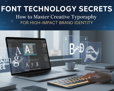
World Cup Logo Fonts: A Practical Guide to Custom Football Jersey Design
A football jersey can have an attractive color palette, detailed patterns, and high-quality fabric, but the design may still feel unfinished when the typography is wrong.
Player names that are too wide, numbers that disappear from a distance, and overly decorative lettering can quickly make an otherwise promising jersey look amateur. This is why choosing the right World Cup logo font should be treated as part of the design system, not as a final decorative decision.
World Cup-inspired typography usually combines bold proportions, strong silhouettes, and a sense of movement. Used carefully, these characteristics can help a local club, school team, community tournament, or supporter brand create a more confident and professional identity.
However, inspiration should not mean copying an official tournament logo. The goal is to understand why the typography works and apply those principles in an original way.
- World Cup Logo Fonts: A Practical Guide to Custom Football Jersey Design
- Why World Cup-Inspired Typography Works on Football Jerseys
- What Font Is Used for the FIFA World Cup 2026 Identity?
- Recommended Fonts for a Strong and Sporty Jersey
- Five Ways to Use a World Cup Logo Font in Apparel Design
- The Best File Formats for Jersey Production
- Improving Typographic Color Contrast
- Common Mistakes to Avoid
- Conclusion
- Frequently Asked Questions About Football Jersey Typography
Why World Cup-Inspired Typography Works on Football Jerseys
Major football tournaments leave behind more than memorable matches. They also create visual languages that people associate with competition, national identity, movement, and celebration.
Typography is a major part of that visual language.
A strong sports typeface usually has clear letterforms, controlled spacing, and enough visual weight to remain recognizable from across a pitch. These qualities are especially important when the font is used for player names, jersey numbers, sponsor marks, and supporter merchandise.
Bold letterforms can also make production easier. They generally contain fewer fragile details, making them more suitable for vinyl cutting, heat transfer, embroidery, and small-scale printing.
That does not mean every heavy font will work. A font can be visually powerful but still fail when:
- Similar characters are difficult to distinguish.
- Counters become too small at reduced sizes.
- Player names become excessively wide.
- Numbers lose clarity when viewed from a distance.
- Decorative details disappear during production.
The best football typography balances personality with function.
What Font Is Used for the FIFA World Cup 2026 Identity?
FIFA unveiled the official FIFA World Cup 26 brand on May 17, 2023. The central emblem places an image of the World Cup Trophy over a stacked “26,” creating a flexible foundation that can be adapted across the tournament and its 16 host cities.
The wider 2026 visual identity uses a custom typeface called FWC26, credited to Alistair McCready at Monolith. It is an ultra-condensed geometric design created to deliver strong visual impact across signage, uniforms, digital graphics, and large-scale tournament communication.
Its tightly packed structure allows large words to occupy relatively narrow spaces. This is useful in stadium environments, where typography must compete with photography, advertising, motion graphics, and architectural scale.
However, condensed display fonts also have limitations. At small sizes, narrow internal spaces and closely positioned characters may reduce readability. This is why a typeface that works well on a poster or stadium banner may not be the best choice for every scoreboard, mobile interface, or small jersey detail.
How to Capture the World Cup 2026 Mood Without Copying It
The official tournament typeface is a proprietary part of FIFA’s identity. Designers should not reproduce the official logo or present unofficial merchandise as an authorized FIFA product.
You can still create a similar contemporary atmosphere by focusing on broader design characteristics:
- Condensed or semi-condensed proportions
- Heavy weights
- Geometric construction
- Compact tracking
- Simple, recognizable numbers
- Minimal decorative details
- Strong contrast against the jersey fabric
Instead of searching for an exact replica, choose a typeface that gives your team its own identity.
Fonts such as Söhne Schmal, Bebas Neue, Archivo Narrow, Teko, Barlow Condensed, Anton, and selected grotesque families can provide different interpretations of a bold contemporary sports aesthetic.
Montserrat Black, Outfit, and Space Grotesk can also work for supporting text, team names, campaign graphics, or merchandise. They are wider and less specialized than an ultra-condensed display face, but their clean construction makes them flexible.
Always test the actual player names and numbers before selecting a font. A typeface that looks impressive when spelling “WORLD CUP” may behave very differently with a long surname or a sequence such as 18, 68, or 88.
Recommended Fonts for a Strong and Sporty Jersey
A complete jersey identity does not always require one font for everything. In many cases, the strongest result comes from combining a distinctive display face with a simpler supporting typeface.
Here are several directions worth considering.
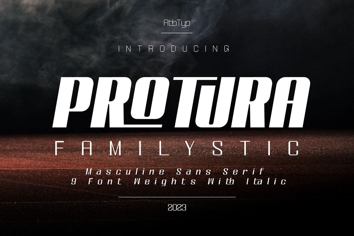
1. Protura — A Strong Masculine Sans Serif
For a more original commercial option, Protura masculine sans serif font offers a solid geometric structure with a confident and disciplined appearance.
Its clean shapes make it suitable for team names, promotional graphics, sportswear packaging, tournament posters, and selected jersey applications. The font can help a local team move away from predictable varsity lettering and toward a more contemporary visual identity.
Before using it for player names or numbers, create a complete test sheet containing:
- The longest player name
- All numbers from 0 to 9
- Similar pairs such as 3 and 8
- Narrow letters such as I and J
- Wide letters such as M and W
- The design at its final production size
This simple test can reveal spacing and readability problems before the jersey enters production.
2. Jersey M54 — A Traditional Athletic Direction
For a classic American collegiate or varsity appearance, a typeface such as Jersey M54 can provide the familiar slab-based structure associated with school sports and traditional athletic uniforms.
This style works particularly well for large back numbers, supporter shirts, team jackets, and retro tournament merchandise.
Because varsity fonts already have a strong visual identity, avoid combining them with too many additional effects. Multiple outlines, shadows, textures, and gradients can make the result look dated or difficult to print.
3. United Sans — Flexibility for Long Player Names
Long player names are a common challenge in jersey design. A wide font may look excellent in a short word but become compressed or distorted when it must fit within a fixed area.
A family with condensed and extended widths gives the designer more control. United Sans is one example of a broad system that can support different typographic roles.
A condensed weight can be used for player names, while a heavier and wider style can be reserved for numbers or campaign graphics. The result feels related without forcing every element to use identical proportions.
Five Ways to Use a World Cup Logo Font in Apparel Design
Owning a good sports font is only the beginning. Placement, scale, spacing, contrast, and production method determine whether the final design actually works.
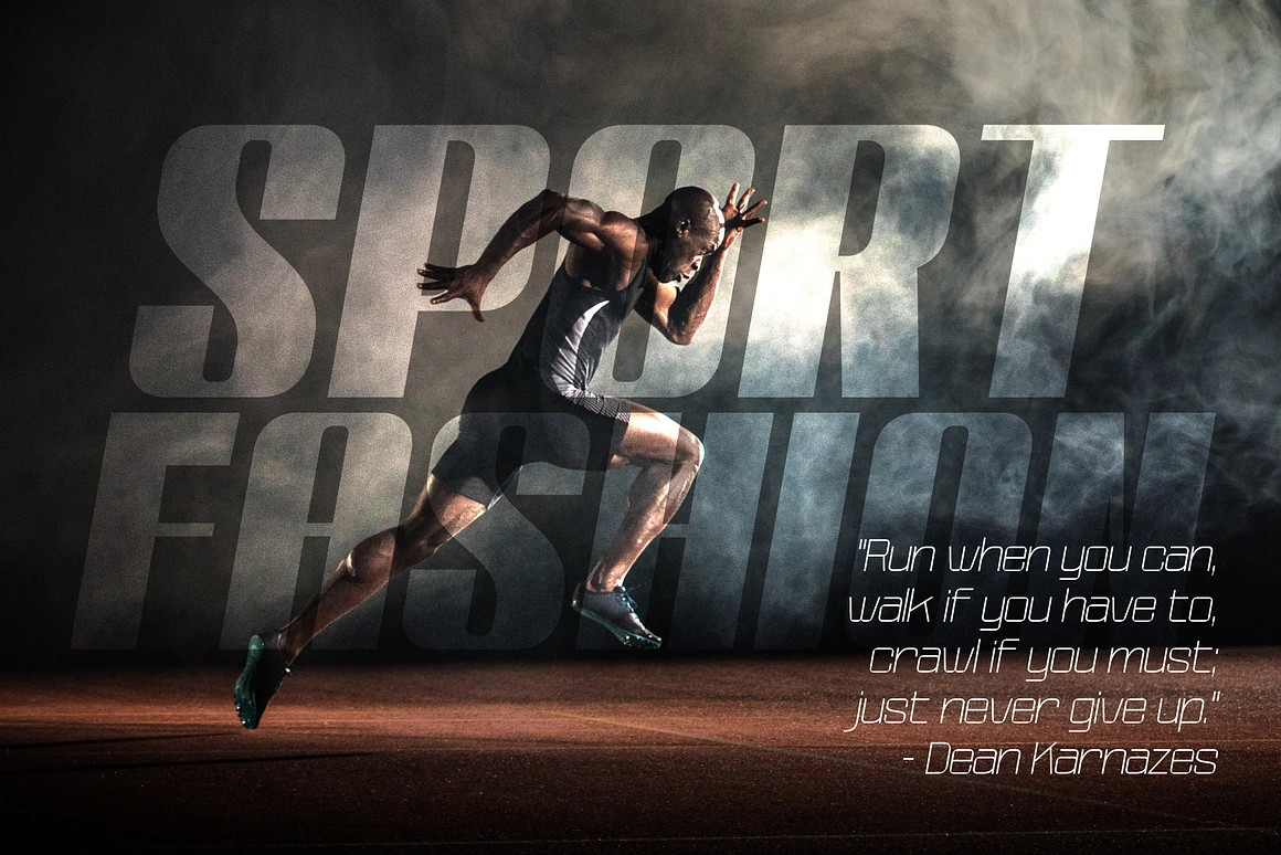
1. Player Names With a Clear Visual Presence
The upper back of a jersey is the primary location for the player’s name. This area must remain readable while the athlete is moving and when the shirt is viewed from different angles.
Start by testing the longest name on the team. Do not design only around the shortest or most visually convenient example.
Adjust overall tracking first, then correct individual kerning pairs where necessary. Avoid squeezing the entire word horizontally unless the font license and design system permit that transformation. Excessive distortion can damage the personality and consistency of the typeface.
For especially long names, consider:
- A condensed font width
- Slightly reduced tracking
- A smaller but still readable size
- A gentle arch
- A separate style for names and numbers
2. Jersey Numbers That Remain Legible at a Distance
The back number is usually the largest typographic element on a football jersey. It must be recognizable from the stands, on broadcast footage, and in photography.
When evaluating a jersey number font, pay close attention to similar forms. The differences between 3 and 8, 1 and 7, or 0 and 6 should remain visible at speed and from a distance.
Small details can add personality, but they should not weaken recognition. Team crests, perforated textures, internal patterns, and decorative cuts should be tested at final size before production.
A detail that looks attractive on a large monitor may disappear or create weak points when cut from vinyl.
3. Team Typography Across the Chest
The front of the shirt may include the club name, nickname, location, founding year, or sponsor.
A subtle arch can help the lettering follow the natural shape of the chest. However, the curve should be controlled. An extreme arch can make the design feel more like a novelty shirt than a professional uniform.
Consider the visual relationship between the team name, crest, sponsor, and shirt pattern. These elements should not compete for the same level of attention.
When the crest is complex, a simpler typeface often produces a more balanced result.
4. Small Slogans Around the Collar
Team mottos and short messages are often placed inside the collar or below the back neckline. These details create an emotional connection without dominating the main jersey design.
Small text requires a font with open counters and simple construction. A highly condensed display typeface may become difficult to read at this scale.
Print a physical sample before approving production. A slogan that appears clear at 200% zoom may become unreadable when printed at a height of only a few millimeters.
5. Supporter Merchandise and Limited Editions
Football typography can extend beyond the match jersey.
Supporter T-shirts, scarves, tote bags, caps, posters, and social media graphics provide more freedom for expressive compositions. Quotes, chants, important dates, city names, and historic match references can become the main visual element.
This is also where an original World Cup logo font direction can create commercial value. Instead of reproducing official tournament branding, develop a visual system around your own team, neighborhood, city, or supporter community.
Always confirm that your font license covers merchandise and commercial products.
The Best File Formats for Jersey Production
[Suggested image alt text: A close-up of football jersey printing with vector number artwork prepared for heat press production]
The best production file depends on the printing method and the requirements of the supplier.
For names, numbers, logos, and simple typography, vector artwork is usually preferred because it can be resized without losing sharpness.
Common vector formats include:
- AI
- EPS
- SVG
- CDR when requested by a CorelDRAW-based supplier
Before sending the file, convert the final typography to outlines while keeping a separate editable master file. Outlining prevents missing-font errors when the supplier opens the design.
Raster artwork can also be appropriate, particularly for full-color sublimation, DTF graphics, photographic textures, and complex illustrations.
When supplying raster artwork:
- Work at the final print dimensions.
- Use the resolution requested by the printer.
- A target of 300 DPI is commonly suitable for detailed artwork.
- Use a transparent PNG or TIFF when transparency is required.
- Confirm the expected color profile.
- Avoid enlarging a small downloaded image.
The production supplier should always make the final technical recommendation because different machines, inks, transfer films, and fabrics have different requirements.
Improving Typographic Color Contrast
A good typeface can still fail when the color contrast is too weak.
Dark navy lettering on a black jersey may look sophisticated on a bright monitor but disappear under stadium lighting or in mobile photography. Similarly, thin white letters may become lost against a highly detailed sublimation pattern.
Test the design in grayscale. When the name and number are difficult to distinguish without color, the tonal contrast probably needs improvement.
Possible solutions include:
- A light outline around dark lettering
- A dark keyline around light lettering
- A solid backing shape
- Reduced background detail behind the number
- A simpler shirt pattern in important identification areas
- Fluorescent or high-visibility accents used selectively
Outlines should be thick enough to survive production but not so heavy that they change the original character of the font.
Common Mistakes to Avoid
One of the most common mistakes is choosing a font based only on a promotional specimen.
Font specimens are designed to show a typeface under ideal conditions. Jersey production introduces completely different limitations: movement, fabric texture, distance, lighting, folds, and printing tolerances.
Other frequent mistakes include:
- Using an unlicensed font on commercial merchandise
- Copying an official tournament logo too closely
- Adding too many outlines and shadows
- Using the same display font for tiny supporting text
- Ignoring long player names
- Failing to test every numeral
- Sending editable text without embedding or outlining the font
- Approving the design without a physical production sample
A ten-minute test sheet can prevent an expensive reprint.
Conclusion
A professional football identity is not created by adding a random “sporty” font at the end of the process.
The typeface must work with the team crest, shirt pattern, production method, player names, numbers, sponsors, and supporter merchandise. It must also remain readable while the player is moving and when the jersey is viewed from a distance.
A good World Cup logo font can provide useful inspiration through its boldness, rhythm, and sense of movement. The strongest result, however, comes from adapting those principles rather than copying an official identity.
Choose a font with the right license, test it under real production conditions, and give your team a typographic system that feels recognizably its own.
Frequently Asked Questions About Football Jersey Typography
1. Can I use a World Cup-inspired font commercially?
That depends on the individual font license.
A font may be free for personal projects but require a paid commercial license for client work, merchandise, uniforms, websites, or downloadable templates. Read the license rather than relying only on the word “free” in a download title.
Using a legally licensed font does not automatically give you permission to reproduce FIFA logos, tournament emblems, national-team crests, sponsor marks, or other protected branding.
2. Is there a standard size for adult jersey numbers?
There is no single universal size for every football competition.
Back numbers around 25–30 cm in height are common on adult jerseys, while smaller front or shorts numbers are often around 8–12 cm. The correct measurement depends on the competition regulations, jersey size, typeface proportions, and printing method.
Always check the relevant league or tournament rules before production.
3. Which printing method is most durable for jersey typography?
The best method depends on the fabric and intended use.
Sublimation is highly durable on compatible polyester because the color becomes part of the fabric rather than sitting on top of it. Polyurethane heat-transfer vinyl is widely used for clean player names and numbers. DTF is flexible for detailed, multicolor graphics and smaller production runs.
Durability also depends on correct temperature, pressure, curing, material quality, garment preparation, and washing instructions.
4. Should player names and numbers use the same font?
Not necessarily.
Using related styles from the same family can create consistency, but different widths may improve functionality. For example, a condensed style may suit long names, while a wider and heavier design may make numbers more recognizable.
The two elements should look related even when they are not identical.
5. What should I test before approving a jersey font?
Test the complete alphabet, every numeral, the longest player name, the shortest player name, sponsor text, collar details, and the final color combinations.
View the design at actual size, print a sample, and check it from several meters away. This provides a far more reliable evaluation than viewing an enlarged mockup on a computer screen.
Recent Posts


FREE PREMIUM FONTS
Clear Filters