- No products in the cart.
The modern man’s bathroom cabinet has undergone a profound transformation. Gone are the days of aggressive, neon-colored ‘3-in-1’ body washes screaming from the shelves with jagged, hyper-masculine fonts. Today, we are witnessing a quiet revolution. If you are an entrepreneur or designer in this space, you must pay attention to this evolution. Discover how the shift in men’s grooming trends demands a new visual language. Learn why minimalist typography and packaging build premium brand identity. Recommended Fonts to Elevate Your Grooming Brand are not merely aesthetic choices; they are the very foundation of your market positioning.
In my experience analyzing hundreds of emerging direct-to-consumer (DTC) brands, the companies that thrive are those that respect their consumer’s evolving sophistication. Men now view skincare and grooming as acts of holistic wellness, not just basic hygiene. This psychological shift requires a completely different visual handshake.
Discover how the shift in men’s grooming trends demands a new visual language.
Learn why minimalist typography and packaging build premium brand identity. Recommended Fonts to Elevate Your Grooming Brand
Let’s break down this massive paradigm shift. Why exactly does a change in consumer habits dictate a change in typography and packaging?
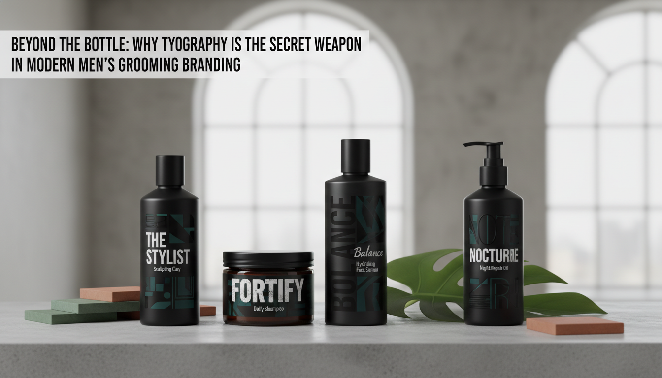
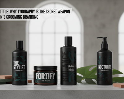
The answer lies in cognitive fluency and perceived value. When a product is housed in a cluttered, loud bottle, the brain instantly associates it with mass-market, low-tier commodities. It feels cheap. Contrast this with a heavy, matte-black glass bottle featuring a single line of perfectly kerned sans-serif text. Immediately, without reading a single word of the ingredients, the consumer expects to pay a premium. It feels exclusive. It feels intentional.
Minimalism in packaging creates a ‘white space’ that allows the quality of the product to speak for itself. It signals confidence. A brand that uses minimalist typography is essentially saying, ‘Our formulation is so superior, we don’t need gimmicks to sell it.’
The Psychology of Minimalist Typography in Premium Grooming
Typography is the silent ambassador of your brand. When we talk about men’s grooming trends and the new visual language, we are largely talking about the death of ‘macho’ fonts.
We have traded distressed display fonts for sophisticated geometric sans-serifs and elegant transitional serifs. Why? Because the modern grooming consumer values transparency, science, and self-care. Clean typography communicates clinical efficacy and purity of ingredients.
Consider the brands dominating the premium market right now. Their packaging feels almost apothecary-like. The minimalist typography strips away gender stereotypes, offering a universally appealing, high-end aesthetic that looks just as good on a curated Instagram feed as it does on a marble countertop.

Recommended Fonts to Elevate Your Grooming Brand
To help you capitalize on this shift, here is a curated selection of recommended fonts that perfectly capture the new visual language of men’s grooming. These selections balance masculinity with modern elegance.
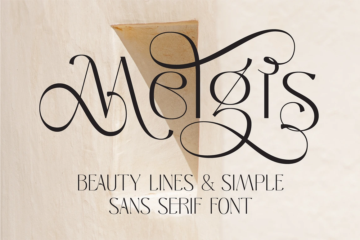
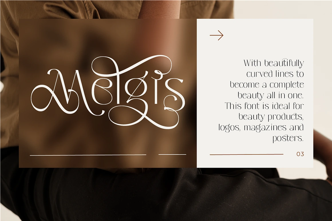
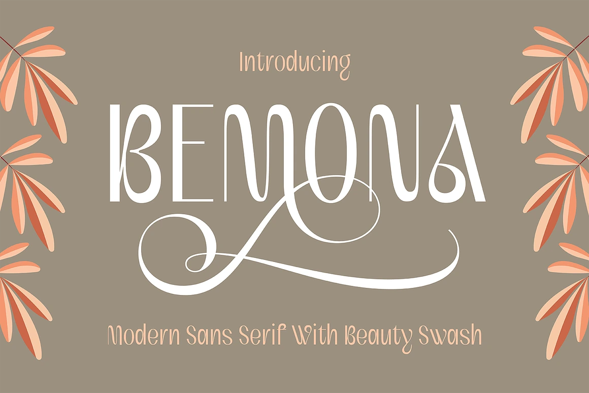
1. Honick – Clean and Modern Geometric Sans
A modern reworking of an absolute classic. Helvetica Now offers incredible legibility and a stark, neutral confidence. It is the ultimate choice for a brand that wants to position itself as clinical, scientifically backed, and highly effective. When used in all-caps with generous tracking (letter spacing), it screams luxury.
2. Poppis – Modern Geometric Sans Serif with Cyrillic
If your brand wants to feel approachable yet premium, GT Walsheim is a spectacular choice. It is a geometric sans-serif that feels slightly warmer and more human than strict grotesques. It works beautifully on minimalist packaging, especially when paired with earth tones or muted pastels—a color palette heavily trending in the new visual language of men’s wellness.
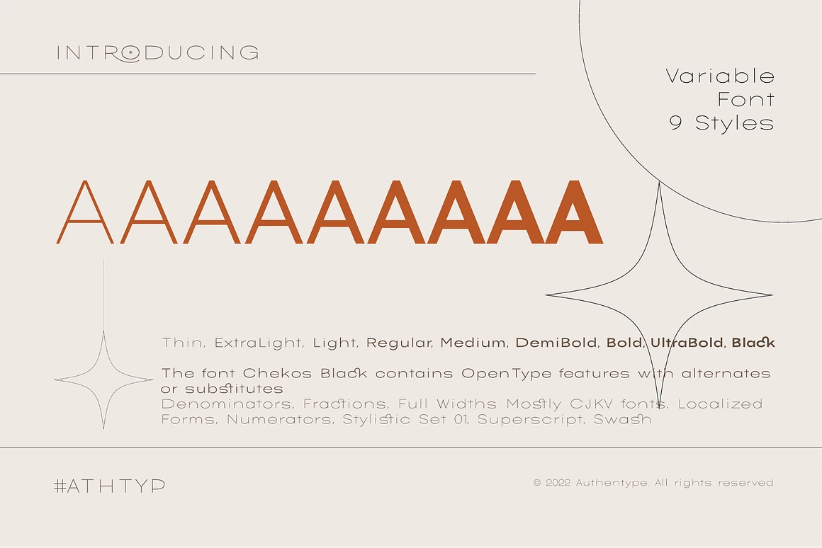
3. Good Rome – The Future of Sans Serif
Who says men’s grooming cannot use serifs? Ogg is a calligraphic serif font that exudes heritage, luxury, and organic craftsmanship. If your grooming brand focuses on botanical ingredients, artisanal shaving creams, or premium beard oils, Ogg provides an immediate sense of established history and high-end exclusivity.
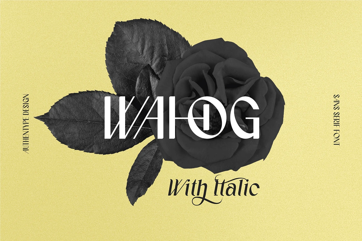
4. Bomerch Modern Display Font
Avenir means ‘future’ in French, and it perfectly encapsulates the forward-thinking shift in men’s grooming trends. It is incredibly versatile. Use the bold weights for striking, authoritative product names, and the light weights for clean, readable ingredient lists.
Implementing the New Visual Language
Transitioning to this new visual language requires more than just swapping out a font. It demands a holistic approach to your packaging design.
First, audit your current use of space. Are you trying to communicate too much on the front of the bottle? Move the noise to the back. Embrace negative space.
Second, reconsider your materials. Minimalist typography relies heavily on tactile experiences. A beautiful font printed on cheap, glossy plastic loses its premium feel. Pair your new typography with soft-touch finishes, frosted glass, or brushed aluminum.
Finally, maintain absolute consistency. From your Instagram ads to your unboxing experience, the typography must remain unified. This consistency is the bedrock of a premium brand identity.
The Future of Grooming Branding
The era of patronizing, hyper-masculine grooming marketing is dead. The brands that will dominate the next decade are those that understand the nuance of modern masculinity. They realize that quiet confidence is far more persuasive than loud insecurity.
By taking the time to discover how the shift in men’s grooming trends demands a new visual language, and taking action to learn why minimalist typography and packaging build premium brand identity, you position your company at the forefront of a lucrative cultural wave. Choose your fonts wisely, embrace the white space, and watch your brand equity soar.


March 17, 2026


Clear Filters