- No products in the cart.

Top 10 Typography Trends Dominating 2026
Explore the definitive guide to Top 10 Typography Trends Dominating 2026. Discover how human emotion and digital evolution shape the future of font design.
The Soul of Syntax: Top 10 Typography Trends Dominating 2026
In the grand tapestry of visual communication, 2026 marks a pivotal year. We have moved past the initial shockwaves of generative AI and the sterile perfection of the early 2020s corporate aesthetic. We are settling into an era where technology is no longer the master of design, but the loom upon which human stories are woven. The typography trends of 2026 are not merely about legibility or modularity; they are a manifesto of the human spirit asserting itself in a digital landscape.
As we explore the top 10 typography trends dominating 2026, we find a common thread: a deep, resonant desire for connection, authenticity, and an acknowledgment of our biological roots amidst a synthetic reality. This is an Authority Pillar guide to the fonts that are shaping our collective consciousness.
- The Soul of Syntax: Top 10 Typography Trends Dominating 2026
- 1. The Neo-Humanist Renaissance
- 2. Bio-morphic Fluidity
- 3. Neuro-Inclusive Type (Hyper-Legibility)
- 4. Ephemeral & Kinetic Variable Fonts
- 5. The “Uncanny Valley” Serif
- 6. Raw Brutalism 2.0
- 7. Dimensional Reality (AR/VR Native)
- 8. Multi-Script Harmonics
- 9. The Imperfectionist Hand
- 10. Chromatic & Textural Layering
- Conclusion: The Return to Meaning
1. The Neo-Humanist Renaissance
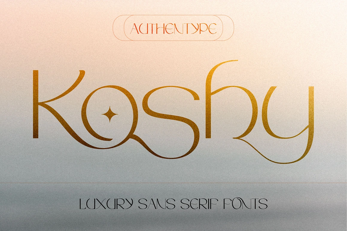
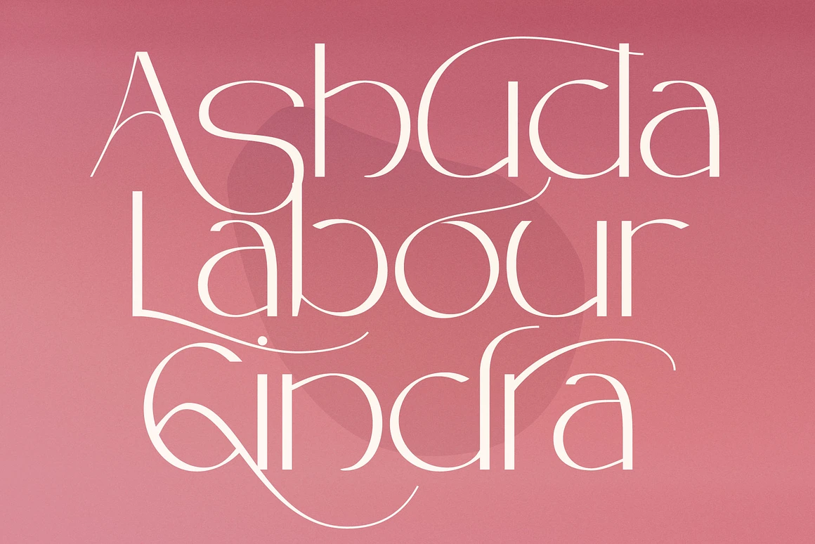
For nearly a decade, geometric sans-serifs ruled the web—clean, efficient, and utterly devoid of friction. In 2026, the pendulum has swung violently back toward the hand of the maker. The Neo-Humanist trend champions serifs with high contrast, calligraphic axes, and organic curves that mimic the pressure of a pen nib. These fonts do not apologize for their idiosyncrasies; they celebrate them. Brands are adopting these typefaces to signal empathy and approachability, moving away from the “tech giant” coldness of the past.
2. Bio-morphic Fluidity
Inspired by the natural world, Bio-morphic typography rejects the rigid grid. These letters appear to be grown rather than constructed. Think of fonts that ooze, stretch, and flow like mycelium or liquid mercury. This trend is a direct response to the climate crisis and our renewed appreciation for nature. It is heavily utilized in sustainability branding and avant-garde editorial design, serving as a visual reminder that everything is interconnected and mutable.
3. Neuro-Inclusive Type (Hyper-Legibility)
What began as a functional necessity has blossomed into a stylistic movement. In 2026, accessibility is the baseline of beauty. Designers are embracing fonts specifically engineered for neurodivergent readers—those with dyslexia or visual processing differences. However, rather than being purely clinical, these typefaces are being designed with tremendous character and warmth. Heavy bottom-weighting, unique character distinctiveness, and generous tracking are now hallmarks of sophisticated, inclusive design.
4. Ephemeral & Kinetic Variable Fonts
Static type is becoming a relic. The variable font technology of previous years has matured into “Reactive Typography.” These fonts breathe. They respond to user interaction, ambient light sensors, or even sound. In 2026, a headline might subtly expand as you scroll or tremble when the context of the article becomes intense. This trend acknowledges that reading is a dynamic, temporal experience, not a passive intake of data.
5. The “Uncanny Valley” Serif
As AI continues to assist in glyph generation, a fascinating trend has emerged: typography that feels almost historical but features subtle, alien geometries. These are the “Uncanny Valley” serifs. They look like 18th-century transitional typefaces at a glance, but upon closer inspection, the terminals are oddly sharp, or the ligatures follow a logic that feels computationally derived yet curated by human taste. It represents the uneasy but beautiful synthesis of man and machine.
6. Raw Brutalism 2.0
Nostalgia for the early, unpolished internet has evolved into a sophisticated Brutalism. This involves using default system fonts (or fonts that mimic them) in massive, anti-aesthetic layouts. It is a rebellion against the over-polished, template-driven designs of the 2020s. It signals raw truth, transparency, and a rejection of marketing fluff. It is typography stripped to its barest bones, demanding attention through sheer starkness.
7. Dimensional Reality (AR/VR Native)
With spatial computing becoming a household norm, typography has finally left the 2D plane. Dimensional Reality fonts are designed with volume, texture, and light interaction in mind. They are meant to be walked around in augmented reality spaces. These are not just extruded 2D shapes; they are sculptural forms where the back of the letter ‘A’ is as designed as the front. This trend is redefining how we think about the anatomy of a letterform.
8. Multi-Script Harmonics
Globalization in 2026 is no longer about Westernizing the world, but about a polyphonic exchange. We are seeing a surge in type families where Latin, Arabic, Cyrillic, and CJK (Chinese, Japanese, Korean) scripts are designed simultaneously with equal weight and respect. The trend is “Harmonics”—where the visual rhythm of the Latin script is altered to match the density and flow of non-Latin scripts, rather than the other way around. It is a typographic decolonization.
9. The Imperfectionist Hand
Distinct from the Neo-Humanist serif, this trend focuses on the scrawl, the scratch, and the doodle. High-end brands are utilizing fonts that look like hurried notes written on a napkin. In an age of deepfakes and AI-generated content, the messy, imperfect human signature is the ultimate stamp of authenticity. These fonts convey urgency, intimacy, and a “behind-the-scenes” honesty that consumers are craving.
10. Chromatic & Textural Layering
Color fonts (OpenType-SVG) have finally found their mature voice. We are moving past simple gradients into fonts that carry inherent texture—grain, noise, and transparency. In 2026, a font file might contain the visual data of watercolor bleeds or neon tube glows. This allows typography to act as both text and image simultaneously, reducing the need for accompanying photography and allowing the word itself to carry the entire emotional weight of the message.
Conclusion: The Return to Meaning
The typography trends of 2026 are not just changing how we read, they are changing how we feel. We are witnessing a departure from the “invisible” design of the past functionality-obsessed era. Today, the font is the message. Whether through the bio-morphic curves of nature or the raw edges of brutalism, typography has reclaimed its status as a humanist art form. It reminds us that behind every pixel, every vector, and every line of code, there is a human heartbeat seeking connection.
Recent Posts


FREE PREMIUM FONTS
Clear Filters