- No products in the cart.

Walk down Bond Street or Fifth Avenue on a rainy Tuesday afternoon, and look at the shop windows. You won’t see shouting colors or cluttered layouts. You see space. Vast, expensive white space anchored by typography that feels almost arrogant in its simplicity. This is the distinct language of high-end design.
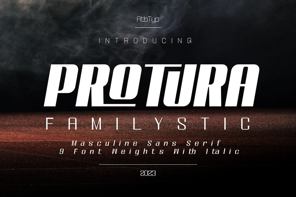
When clients ask me about the best fonts luxury branding requires, they usually expect me to rattle off names like Didot or Bodoni. While those are the heritage choices—the typographic equivalent of a vintage trench coat—the landscape has shifted dramatically since around 2017. We aren’t just looking at high-contrast serifs anymore; we are looking at a battle between heritage and the “blanding” of modern luxury.
The Didone Legacy: Drama in High Contrast
For decades, if you wanted to sell a $5,000 handbag, you used a Didone. These are typefaces characterized by extreme contrast between thick and thin lines. Think of the Vogue masthead. They are elegant, yes, but they are also fragile.
Here is the technical issue most designers ignore: those razor-thin hairlines disappear on mobile screens. I’ve seen beautiful wordmarks crumble into pixelated dust on an iPhone 12 Mini. If you choose a font like HTF Didot or Bodoni 72, you are signaling tradition. You are telling the customer that this brand has been around since horse-drawn carriages, even if the LLC was formed last week.
However, purely from a legibility standpoint, relying solely on these classics is risky. They require distinct printing techniques—foil stamping or high-GSM paper—to truly shine. On a screen, they often need manual hinting to look crisp.
The Sans-Serif Takeover (and Why It Matters)
Around the time Hedi Slimane took over Celine, something shifted. The accents dropped. The serifs vanished. Luxury brands started trading their unique, quirky logotypes for stark, geometric sans-serifs. Burberry did it. Saint Laurent did it. Balmain followed suit.
Why? Utility and globalization. A clean sans-serif like Proxima Nova (though perhaps a bit overused) or a custom cut of Futura translates universally. It reads perfectly on a billboard in Shanghai and a smartwatch in London.
When selecting fonts luxury consumers respond to in this category, look for:
- Geometric precision: Perfectly round O’s.
- Humanist touches: Subtle variations in stroke width that prevent the font from looking like a tech startup.
- Gill Sans or Avante Garde variants often work well here if treated with respect.
Honestly, I find this trend a bit sterile. It strips away some of the romance. But from a purely strategic perspective, it creates a blank canvas where the product becomes the sole focus. The logo stops being a signature and becomes a label.
The Secret Ingredient: Kerning is King
The specific font matters less than how you treat it. You could take a basic font like Montserrat, which is free and widely available, and make it look expensive simply by adjusting the tracking.
Luxury breathes. It doesn’t rush.
Cheap branding is cramped; letters jostle for attention. High-end branding allows for generous spacing. If I’m setting a tagline for a premium skincare line, I’m often pushing the tracking out to +100 or even +200. This lateral space implies that the brand is confident enough not to shout. It invites the eye to travel slowly across the word.
My Top Picks Fonts Luxury for 2026
If you need actionable starting points, here is where my head is at right now:
- Reging: Elegant Serif Font for Beauty Branding is an elegant serif typeface designed with clean strokes and refined details, making it ideal for beauty product packaging, skincare labels, fashion editorials, and luxury brand identities.

- Melgis TP: Is a sophisticated beauty serif font family with 9 elegant font weights from Thin to Black. Designed for luxury branding, magazines, editorials, and beauty product packaging, this font is perfect for creating a timeless and professional look.

- Leotaro: Latin and Cyrillic Font is a refined serif typeface inspired by the Reclaim font. With its simple yet elegant design, Leotaro latin and cyrillic font is crafted to make your projects unforgettable.

- Balbes: Modern Serif Font with multi shapes and lines. There are two types of letters by activating stylistic alternates you will get a very contrasting feel than regular letters. It was also followed by the addition of swash, many ligatures, and many languages.

Selecting the right typeface isn’t about picking the prettiest one. It is about deciding whether you want to whisper or command. In the luxury sector, the loudest voice in the room is usually the one with the least to say. Choose type that holds its ground in silence.


March 2, 2026


February 3, 2026


February 2, 2026

January 23, 2026


Clear Filters