- No products in the cart.

Why Variable Fonts Are Finally the Default? I still vividly remember the specific headache of managing typography for content-dense websites back in 2016. It was always a binary choice, and usually a painful one. You had to decide: do we want the design to look sophisticated with Light, Regular, Semi-Bold, and Extra-Bold weights, or do we want the page to actually load before the user loses patience on a spotty 3G connection?
Usually, performance won. We would strip the design down to just Regular and Bold, making the interface feel functional but frankly, a bit sterile. It was a frustrating conversation I had with nearly every creative director I worked with between 2015 and 2018.
That conversation is effectively dead.
With browser support sitting comfortably at 98%, Variable Fonts have graduated from “fancy experimental tech” to the absolute standard for responsive design. The transitional era—where we nervously checked “Can I Use” before writing a line of CSS—is over. If you are still serving static font files with separate HTTP requests for every single weight and style, you are optimizing for a version of the web that doesn’t exist anymore.
The End of the File Size Penalty
The math used to be brutal. If you wanted a rich typographic hierarchy, you were often spending 300kb to 400kb just to render text. On a Tuesday afternoon in a busy coffee shop with congested Wi-Fi, that lag is noticeable. It causes layout shifts, text popping in and out, and generally distracts the reader from the content itself.
Variable Fonts solve this by packing every weight, width, slant, and optical size into a single, highly efficient file. Instead of five or six round-trips to the server, the browser makes one.
For instance, I recently refactored a client’s e-commerce platform. We replaced seven distinct static font files totaling a hefty 218kb with a single variable file measuring just 46kb. That isn’t a marginal gain; that is a fundamental shift in how the page renders.
Typography That Actually Breathes
Performance is the metric we sell to stakeholders, but the real value here is “soul.”
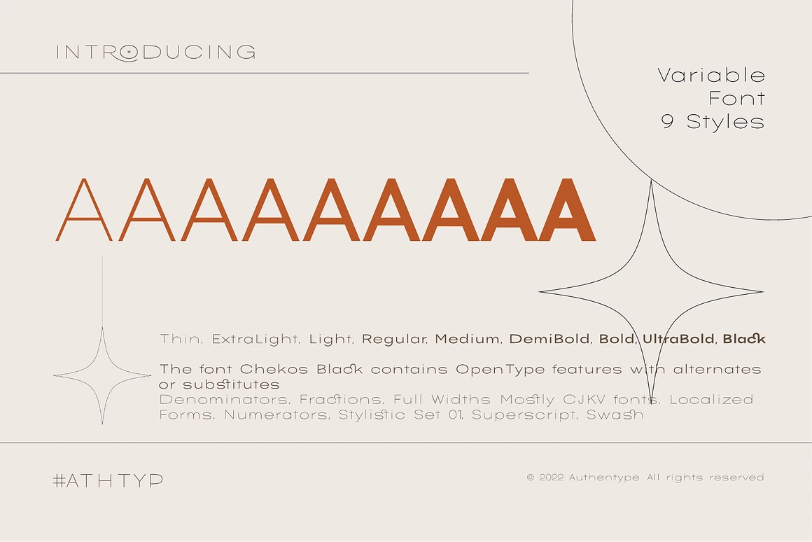
Static fonts are incredibly rigid. A font with a weight of 700 is always 700, whether it’s on a 27-inch 4K monitor or a cracked iPhone SE. Variable technology allows us to interpolate axes seamlessly. We can set a headline to a weight of 725 on a desktop for maximum impact, but scale it down to 680 on mobile to maintain legibility without the letters bleeding into each other.
It allows the text to react to its environment. You can program the font width to narrow slightly as the viewport shrinks, preserving the line length without forcing a smaller font size. It feels organic. It looks like the text belongs on the specific device it’s being read on, rather than being forced into a container that doesn’t fit.
A Realistic Note on Implementation
I don’t want to paint this as a magic bullet without friction. While support is high, the mental model shift is significant.
Designers and developers often struggle when switching from a discrete system (selecting “Bold”) to a continuous system (selecting a value between 100 and 900). I’ve seen cleaner codebases get messy because developers struggled with the font-variation-settings syntax.
There is also a risk of over-optimization. I’ve seen teams load Variable Fonts files containing axes they never use like a ‘Casual’ or ‘Slant’ axis which inadvertently made the file size larger than the static versions they replaced. You have to be intentional. If you aren’t going to use italics, don’t include the axis.
As for the remaining 2% of legacy browsers representing millions of users, mostly on older hardware in emerging markets a simple fallback strategy is necessary. But let’s be clear: legacy constraints should no longer dictate your primary architecture.
The days of rigid, static typography are behind us. The web is far better for it.


March 2, 2026


February 3, 2026


February 2, 2026

January 23, 2026


Clear Filters